Role: Concept & Design.
Collaborators: Motorsport Business Unit — Motorsport Creative Director & Footwear Design Director.
Brand Design - Creative Director.
My task was to create a wordmark for SPEEDCAT that would support the product's current positioning while allowing it to expand across future distribution channels, from core motorsport retailers to speculative premium streetwear environments. The wordmark needed to resonate with motorsport enthusiasts while feeling equally at home within contemporary fashion culture. The streetwear distribution hadn't existed at the time.
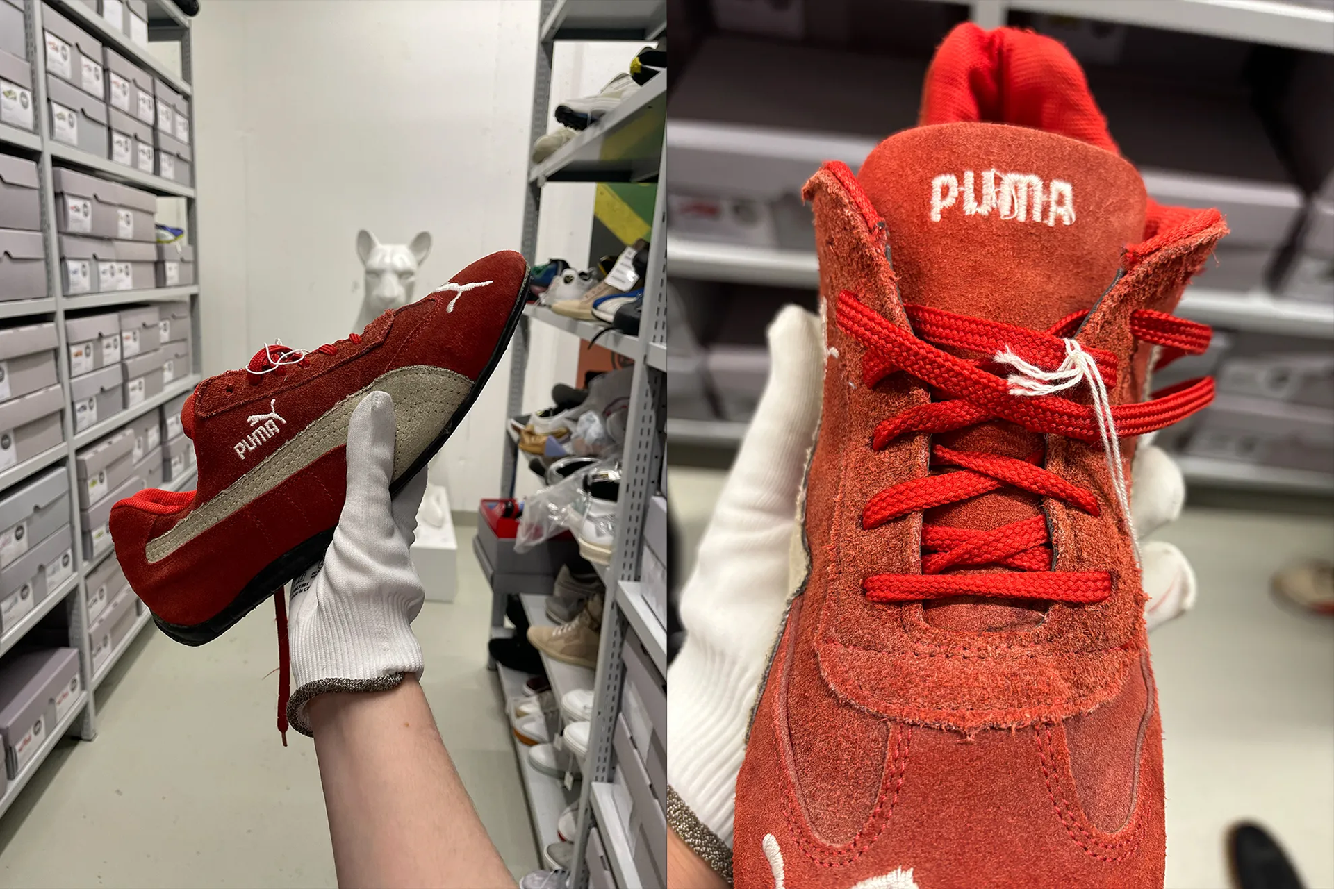
Context: PUMA Archive
In 1999, PUMA created the RACECAT, a fireproof shoe for Motorsport drivers.
One year later, in 2000, PUMA introduced a low-profile version called SPEEDCAT for race fans. It was wildly successful, taking on a life of its own and spurred spin-off renditions; FUTURECAT, RDG-CAT, R-CAT and DRIFTCAT, as well as team-specific pairs.
The SPEEDCAT had never had its own logo, but more than twenty years after its debut, PUMA Motorsport approached me to create the first wordmark for the franchise.
It is important to note that, at this point, the shoe was exclusively managed by PUMA Motorsport. The team had recognised that several trends were beginning to collide: low-profile footwear was gaining momentum, motorsport-inspired product was becoming increasingly relevant, and Formula 1 was entering a new wave of cultural popularity. PUMA found itself at the centre of all three, with over twenty years of authentic SPEEDCAT heritage to support the opportunity.
Communicating speed
This became one of the biggest questions throughout the project.
SPEEDCAT began life as a genuine racing shoe before being adopted by a much broader audience, so retaining that connection to motorsport felt important. During my time at PUMA, we'd (PUMA Brand Design) often spoken about how italics had become the default way of communicating speed, but that they weren't the only solution and, more often than not, were something to avoid. I deliberately didn't go down that route.
Instead, I started researching other visual cues associated with speed. The challenge was finding a balance between expressing performance while creating something that would work for both motorsport enthusiasts and a speculative broader streetwear audience.
That thinking led me to speed dials. Some references, such as digital LED dashboard displays, immediately communicated speed, but they also felt dated and clunky. Others, with thinner, lighter forms, felt more contemporary while still carrying a sense of performance. Those became the more interesting direction to explore.
Study - Seeing how speed looks.

PUMA SPEEDCAT Speed Dial - Trail to see how a number set I created would work to communicate speed.
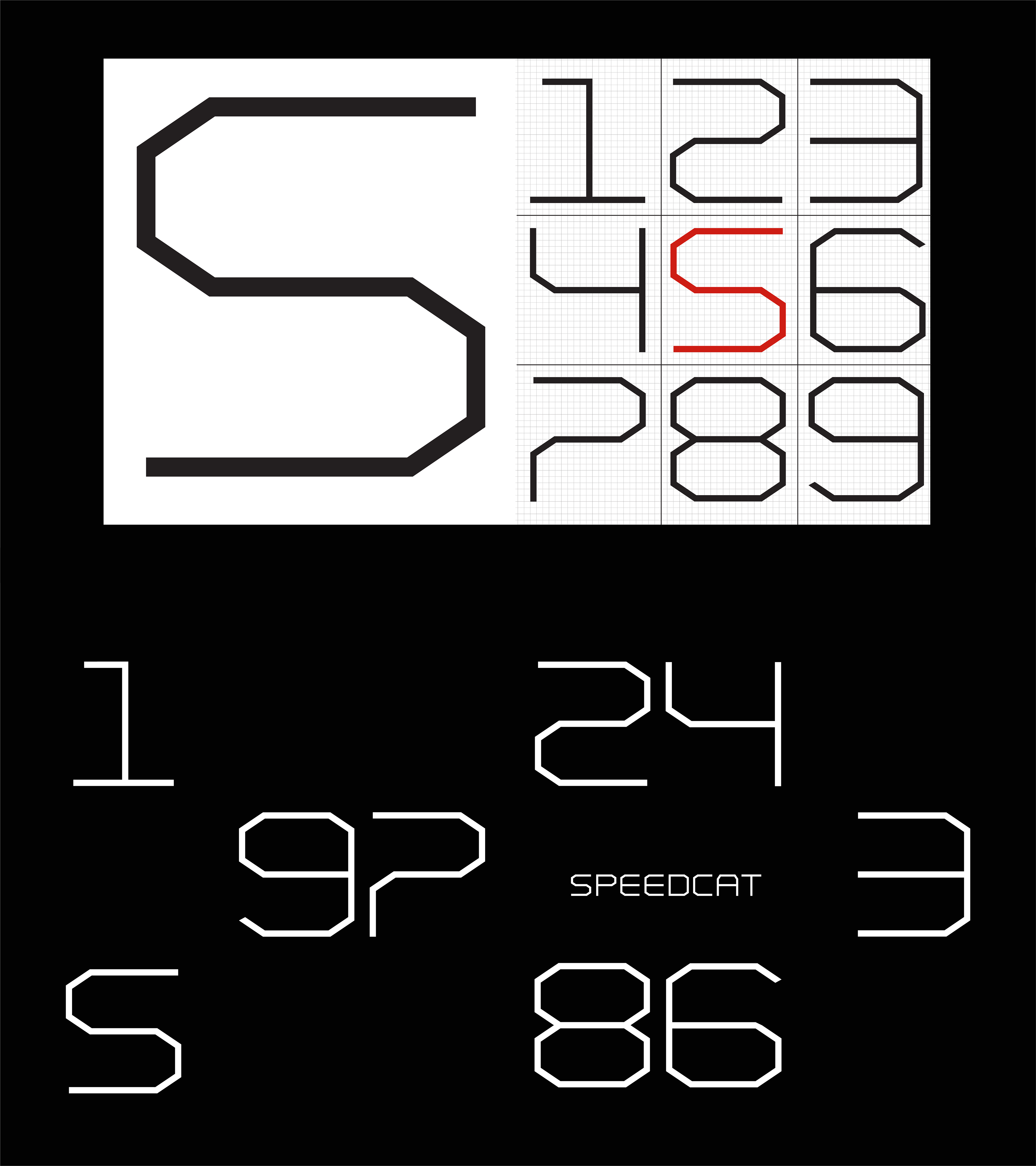
SPEEDCAT - first formed from a trial of speed dials, using a square grid.
The number set became a way of testing the visual language. I placed it into a motion study to see if it could genuinely communicate speed. I felt it had potential, which became the first step in developing the final SPEEDCAT mark.
From there, I created the specific letterforms for SPEEDCAT, refining and adjusting individual characters to find the right balance. The challenge was to create a mark that reflected speed, represented a shoe with its heritage in racing, worked for the current motorsport consumer, and could potentially appeal to a future streetwear consumer. That future audience itself had different layers, from fitting comfortably in FOOTLOCKER through to feeling at home in retailers such as KITH and END.

Trial - 0 to SPEEDCAT - I was interested in the speed dial idea and how the letters of the wordmark could be constructed the same way and morph into each other.
Branding product
Through my personal work with Stampselector and my own interest in sneakers, I had followed many conversations around brand re-releases and the importance of preserving what made original products special. A common sentiment among sneaker enthusiasts was that when a product is brought back, the original should remain the original, especially when it comes to the branding.
For SPEEDCAT, the shoe had historically only carried the PUMA No.1 logo on the tongue and the lateral side, so we deliberately chose not to introduce additional exterior branding. Instead, there was a proposal to introduce the SPEEDCAT mark on the sockliner, allowing the identity to exist as part of the product without changing the character of the original silhouette.
SPEEDCAT PRO was a different story. Designed for today's athletes, this version was created with a different purpose and carried the SPEEDCAT PRO mark as part of its performance identity. It's been a helpful addition considering athletes like Daniel Riccardo would drink a "shoey" to celebrate a win.
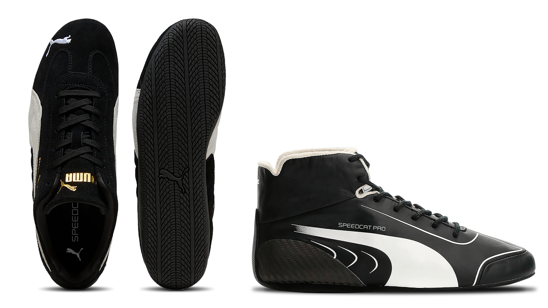
SPEEDCAT - A sockliner proposal / SPEEDCAT PRO - Decision made to brand the outside of the PRO drivers' racing shoe.
SPEEDCAT Franchise
As the Motorsport category identified, SPEEDCAT was perfectly positioned to capitalise on the intersection of several cultural trends coming together. Low-profile footwear was gaining momentum, motorsport-inspired product was becoming increasingly relevant, and Formula 1 was reaching a new audience through documentaries such as Netflix's Drive to Survive.
The shoe quickly grew beyond its original category, with the new logo becoming part of different distribution channels and supporting a range of strong sneaker reinterpretations. New colourways, materials, and upper modifications, such as the SPEEDCAT Ballet, helped connect the silhouette with different consumers.
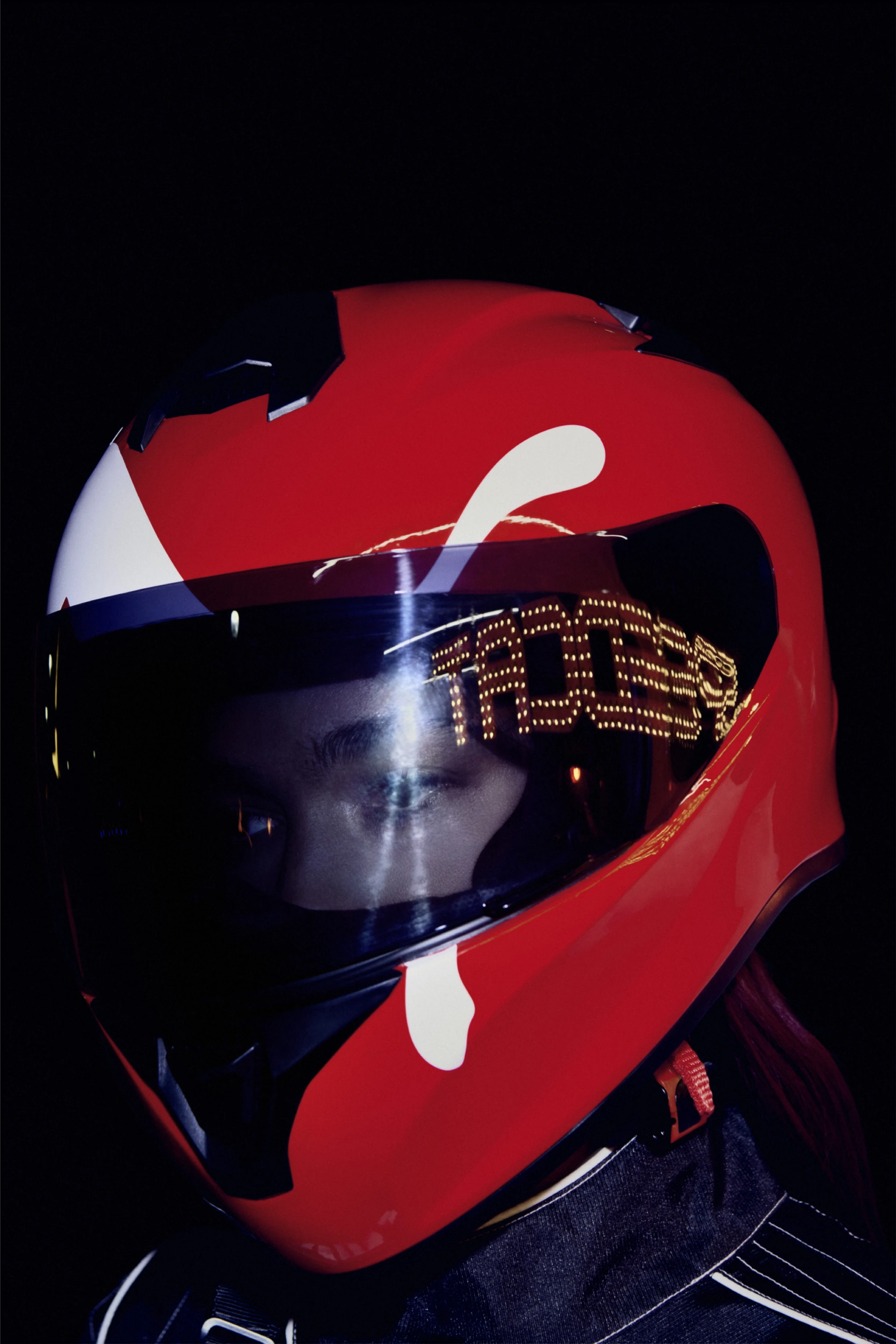
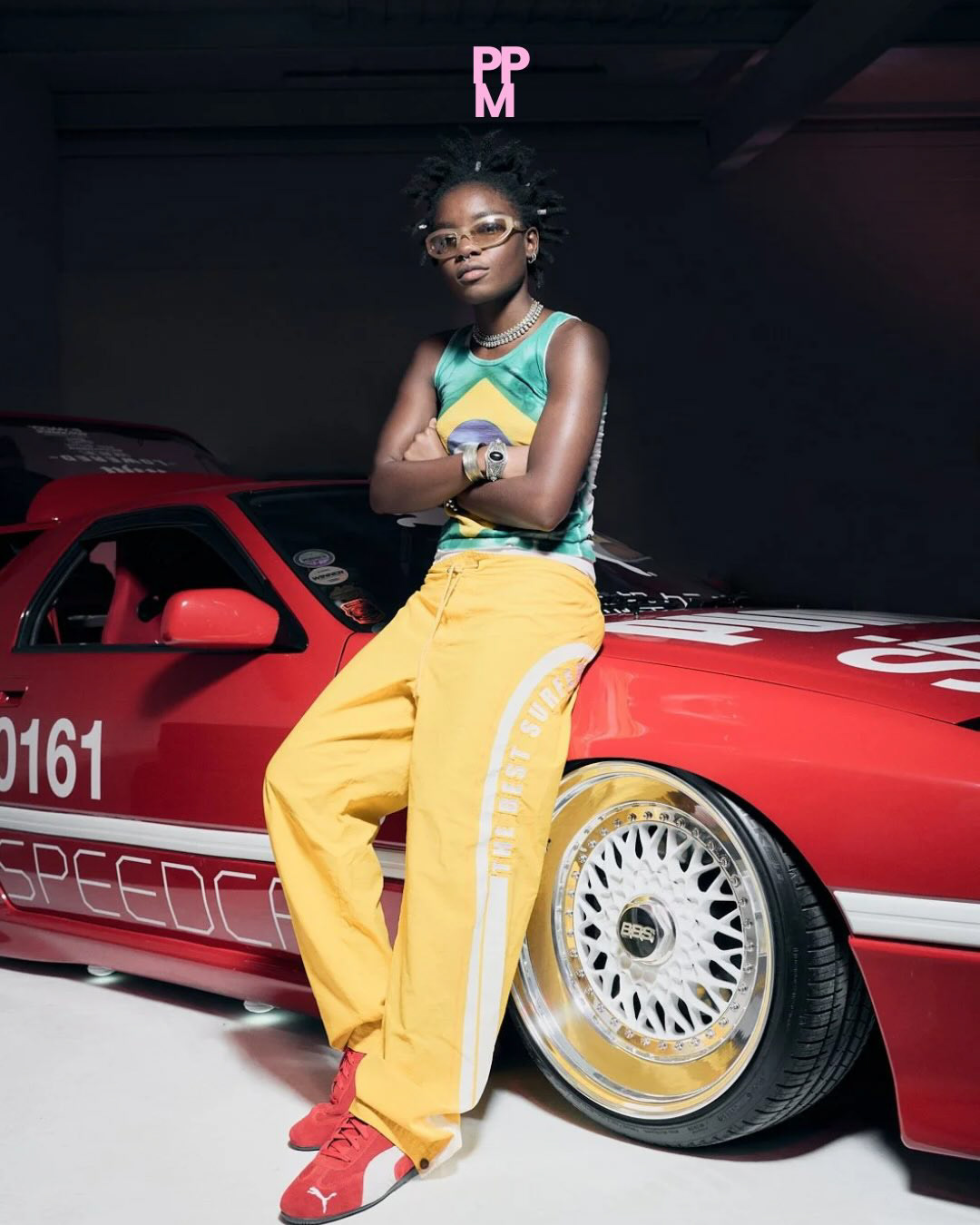
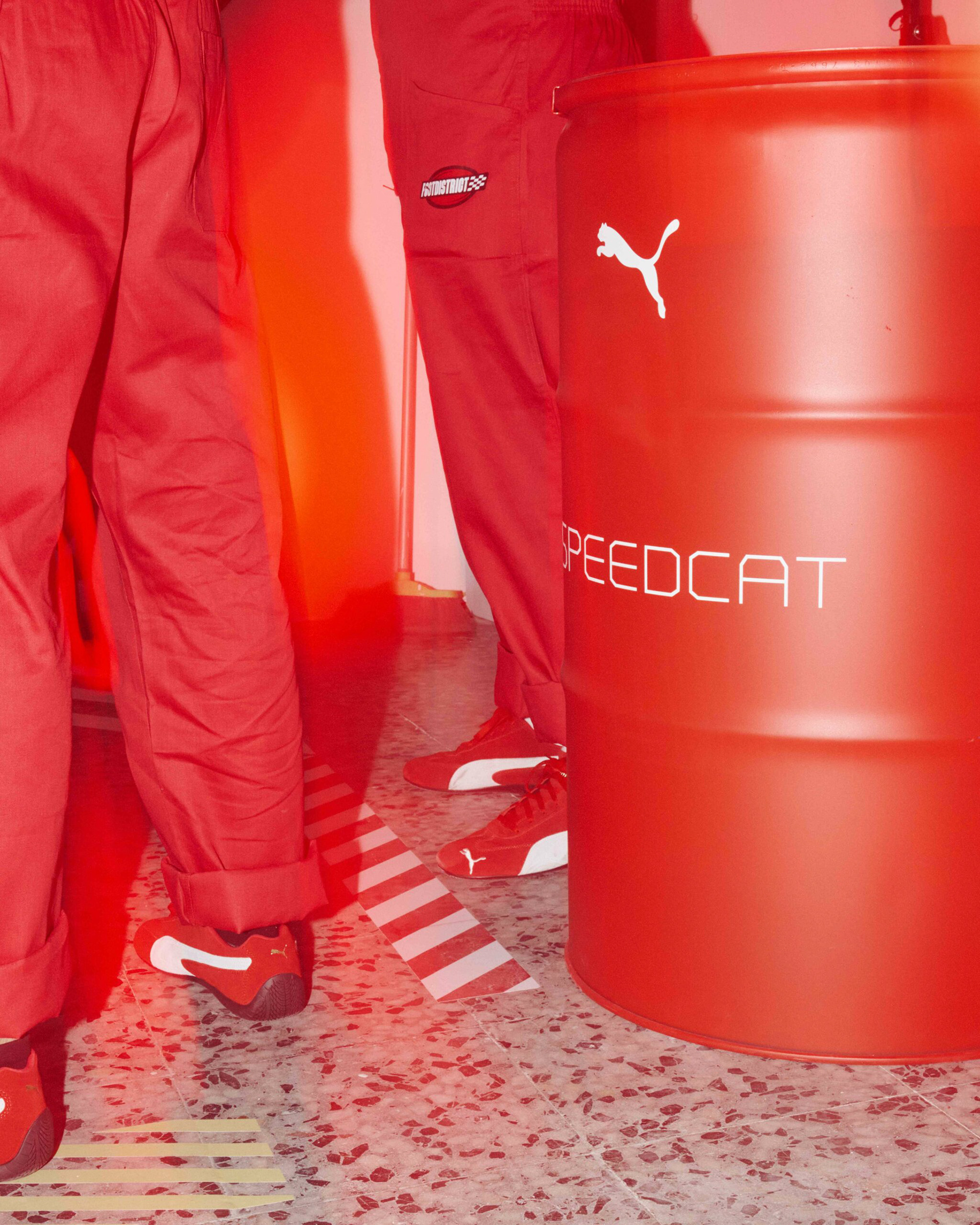
The wordmark was applied across a range of marketing activations, where the logo appeared as Vegas-style signage, on racing helmets, cars, and other environments. Seeing it move between these different contexts demonstrated how the mark could sit comfortably within both the motorsport world it came from and the broader cultural spaces SPEEDCAT was beginning to enter.
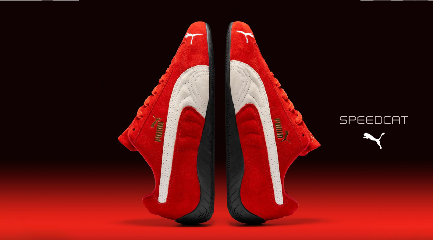
Communication lock up.
Photographs ©PUMA , ©Size? and ©footdistrict.